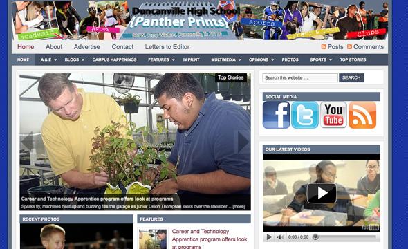
The Panther Prints website www.dhspantherprints.org was selected as a National Scholastic Press Association Pacemaker finalist. The list of winners was released today. Panther prints was one of the 15 selected as a finalist in there category. The winners will be announced for the first time at the spring JEA/NSPA National High School Journalism Convention in Anaheim, Calif., on Saturday, April 16, 2011.
A total of 166 high school websites entered the contest to compete for the top awards. The sites ware judged by staff at the Star Tribune. Entries were judged holistically based on content, design, writing and editing, rich media and breaking news. Comments from the judging team can be found below.
Here are the comments released in the NSPA press release by the judges of the contest.
Online Pacemaker judging team comments:
First, it is important to put the name and location of the school on the site. While most of your visitors will know this, it is still an important detail that every publication (on or offline) should present. Plus it has an impact on how search engines will see your site.
Second, the front page of your website should not include content that is older than a month or two. The web ages quickly and old stories indicate that the editorial team isn’t updating very often and visitors aren’t coming frequently. It is more desirable to have a shorter page with less content than to have a long page with items that are out of date.
Content carousels are cool but should be used deliberately and not because a CMS template offers them. Consider how long each slide is shown, how the animation works, how to place the captions. You must have compelling photography for these to be effective, if a story doesn’t have good image you should not splash it across the top of the page. Also, check to make sure that there is as little duplication as possible: some sites have the same story in three or four places on the front page.
Remember that this is the web and not a print. When you just transport the print work over to the web it shows. Much of what is produced for print may be used on the web, but it should be considered for the new form (hyperlinks added, photos added, etc) to become “web native.” This is a problem all over journalism and it was sad to see some student publications fall into the trap that many professional media organizations are trying to dig themselves out of these days.
Finally, and most importantly, make sure that you are communicating towards a specific audience. Is your site something that your peers would seek out? Is everything you’ve included important to them? The best sites are the ones that engage their readers through effective communication to that audience. Be sure to know who you are writing/designing/developing for.
The top sites set themselves apart by succeeding on these dimensions. These sites also stood apart for:
- Excellent photography. Using images inside their templates to best effect—no stretching or low-res artifacts.
- Compelling writing. Interesting stories well told with good web-native features.
- Design outside of the template. Every CMS comes with a standard template but some publications were able to transcend that and make it truly their own.
- Effective use of multimedia. The balance between having using all the tools that are available and still staying focused on telling a good story was best demonstrated in the winning publications.
